
Also if it's split into geographic/geopolitical or geoeconomic regions that would be nice too.
Does anyone here study this? Or already have this data?
(maybe there's something in your gun debate folder)
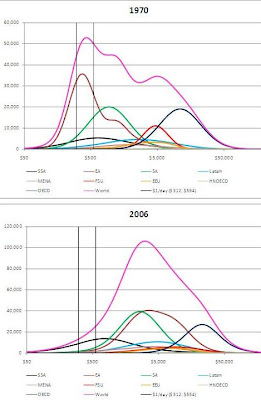
Anyway, here's some nice graphs showing the world's poor disappearing as the planet gets gradually richer.
A lot you may be familiar with the \"these poor ppl make under $1 a day\" metric. Good news!
http://www.voxeu.org/index.php?q=node/4508Although world population has increased by about 80% over this time (World Bank 2009), the number of people below the $1 a day poverty line has shrunk by nearly 64%, from 967 million in 1970 to 350 million in 2006.